MAX
WHITING



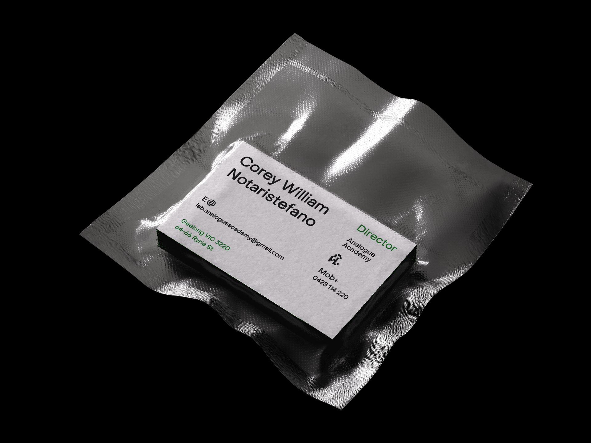


Analogue Academy Rebrand
The identity system for an independently owned cafe and film development lab, Analogue Academy. Situated in Geelong, this unique establishment serves as a creative hub and actively champions local artists, voices, and community through curated exhibitions. Inherent in its name, the brand embraces ideas of form in space, tactility, and play.
The letter A takes centre stage, showcasing its versatility as it both creates and breaks space. This play with form encapsulates the brand's active and dynamic role within the local arts community.
Anchored by the sensibility of PP Object Sans, the brandmark embodies accessibility and clarity across all communication formats. This reflects the brand's commitment to inclusivity and ensures a cohesive and recognisable visual language.
Analogue Academy Film
Packaging
2023
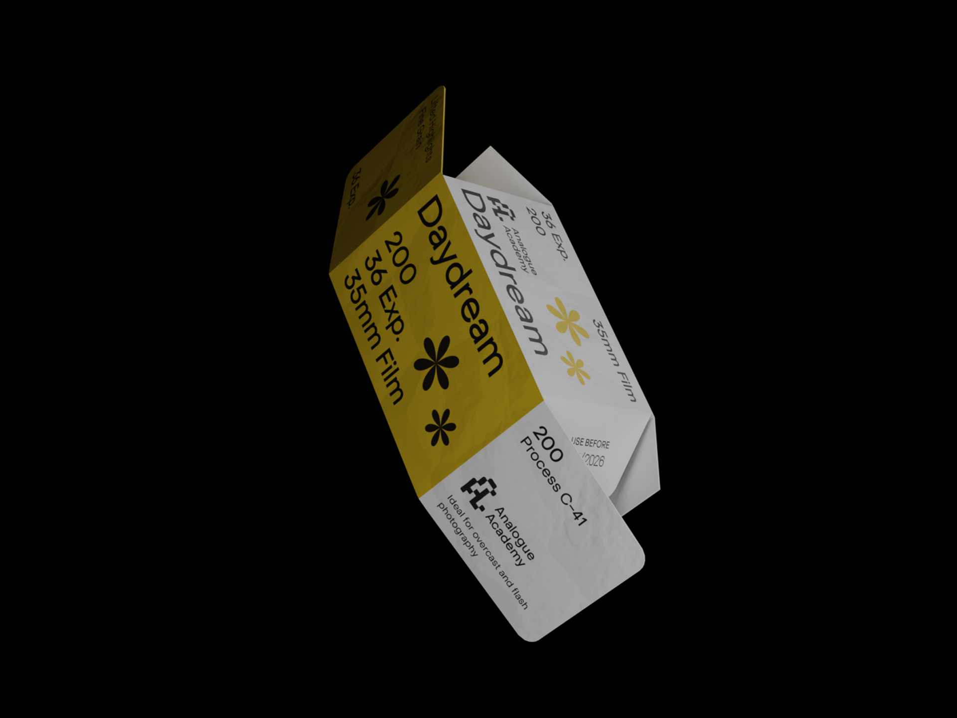
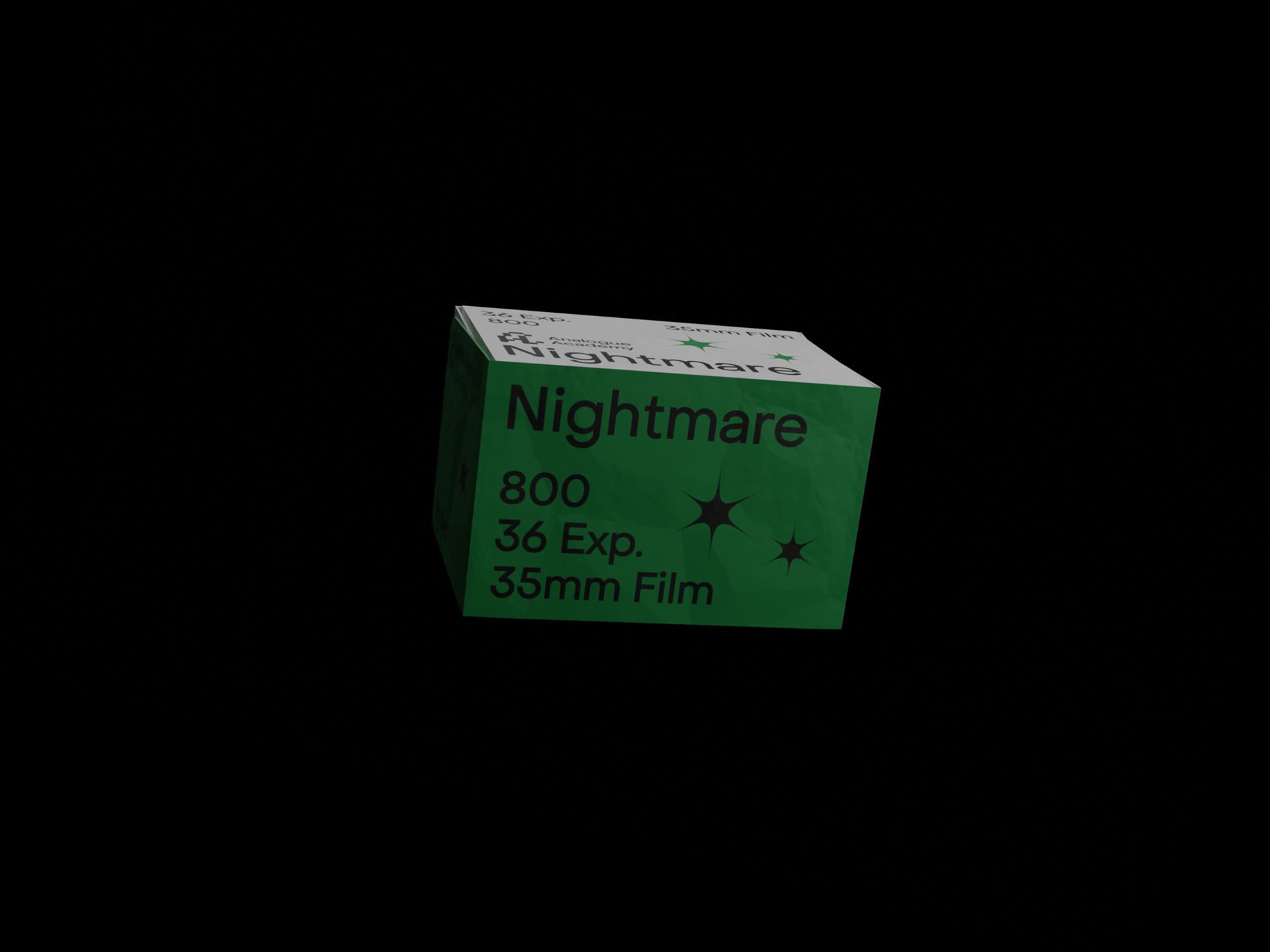


Analogue Academy Speciality Film Packaging
The Art Direction for Analogue Academy's specialty film packages is a visual exploration that elevates the brand's identity through distinctive product offerings. Each package is titled to capture the essence of the film stocks, creating a cohesive and visually striking extension of the Analogue Academy brand.
Drawing from this language mobilises the package's conceptual approach towards consistency, high quality, and visible punch, reinforcing Analogue Academy's commitment to excellence.
The Last Days of Detroit
Publication
2023
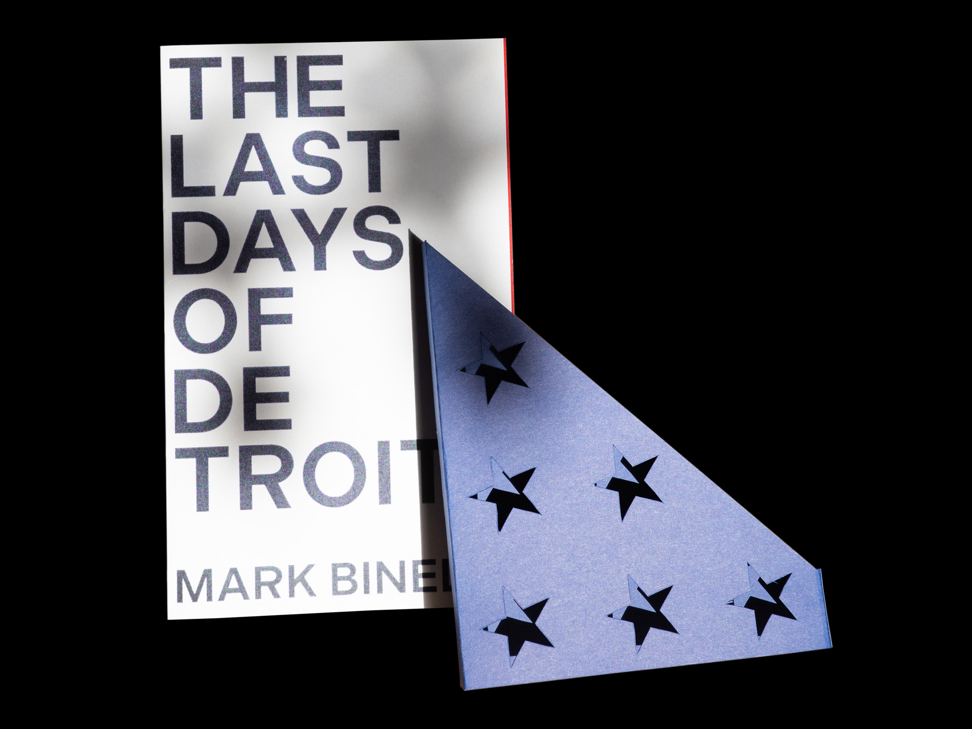
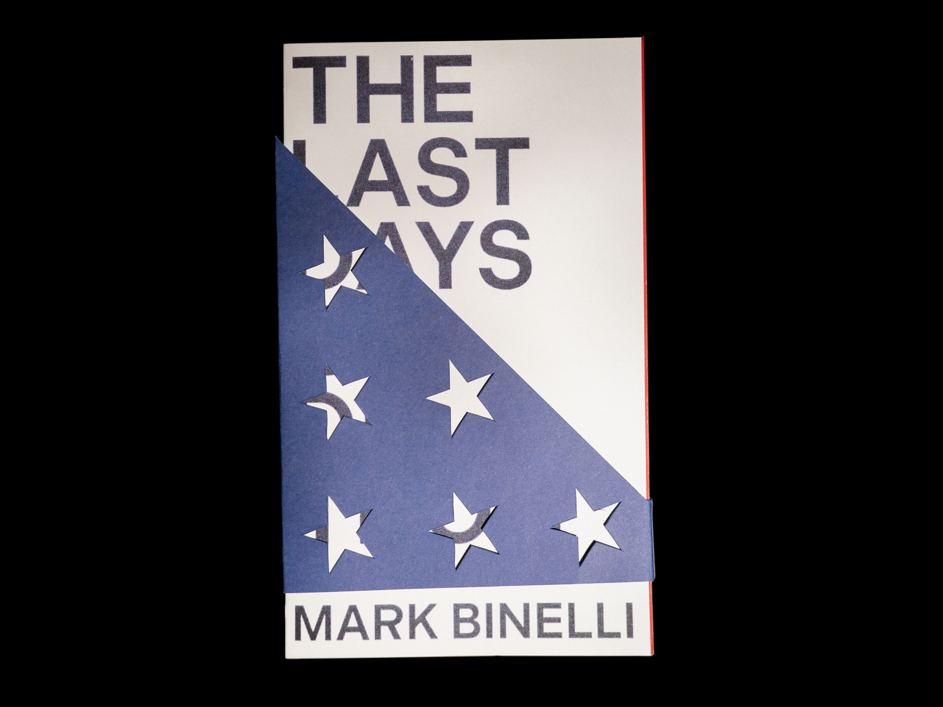

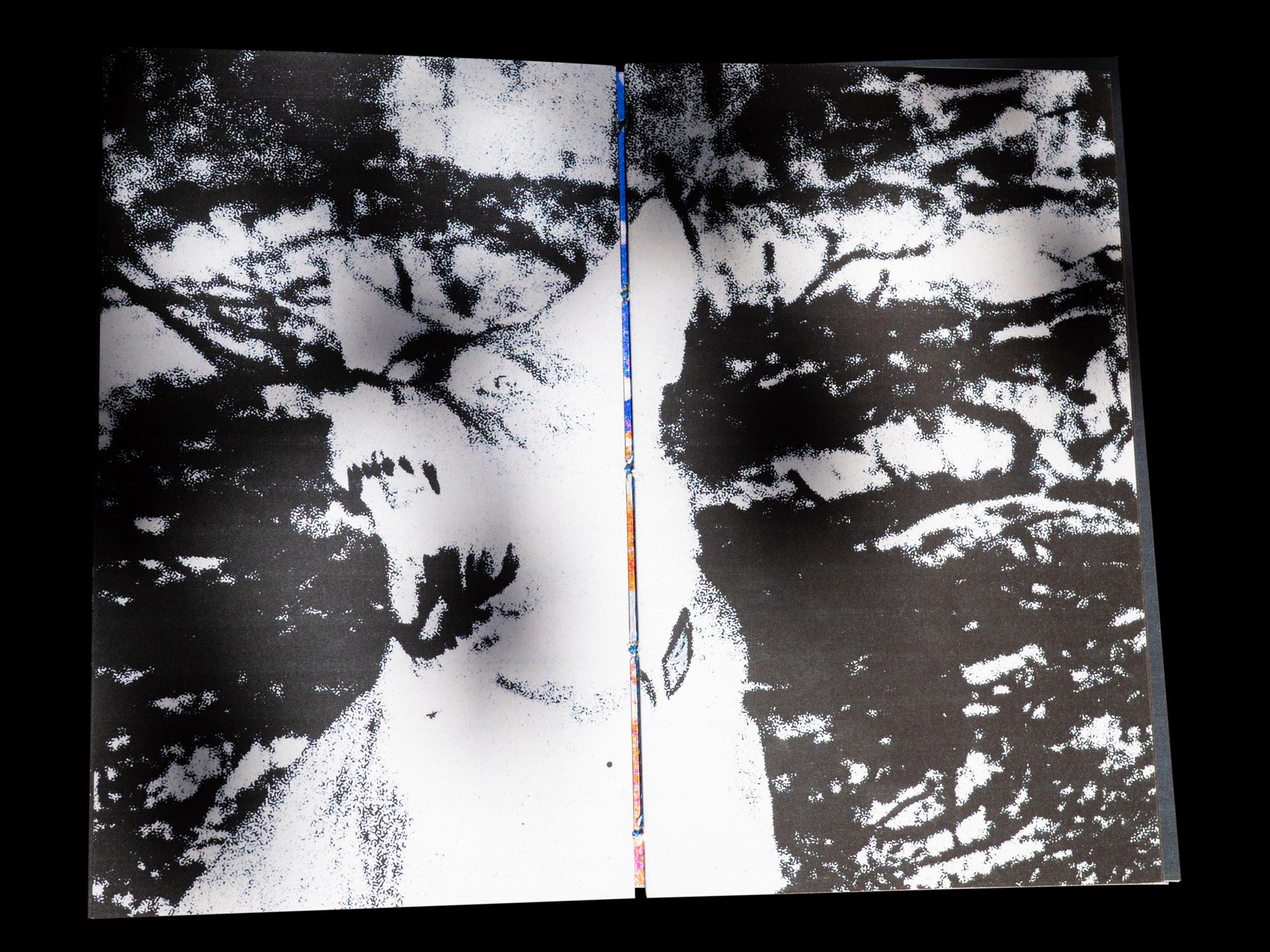

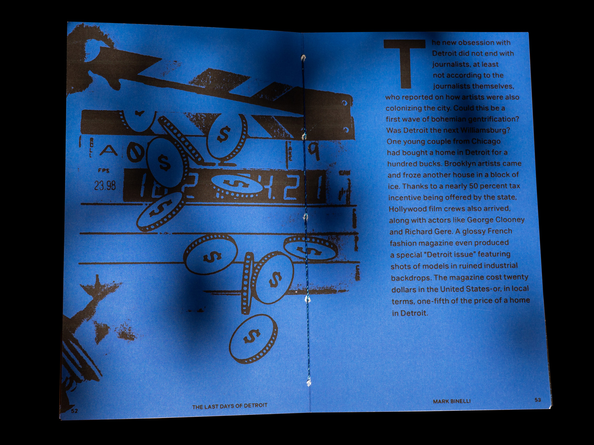
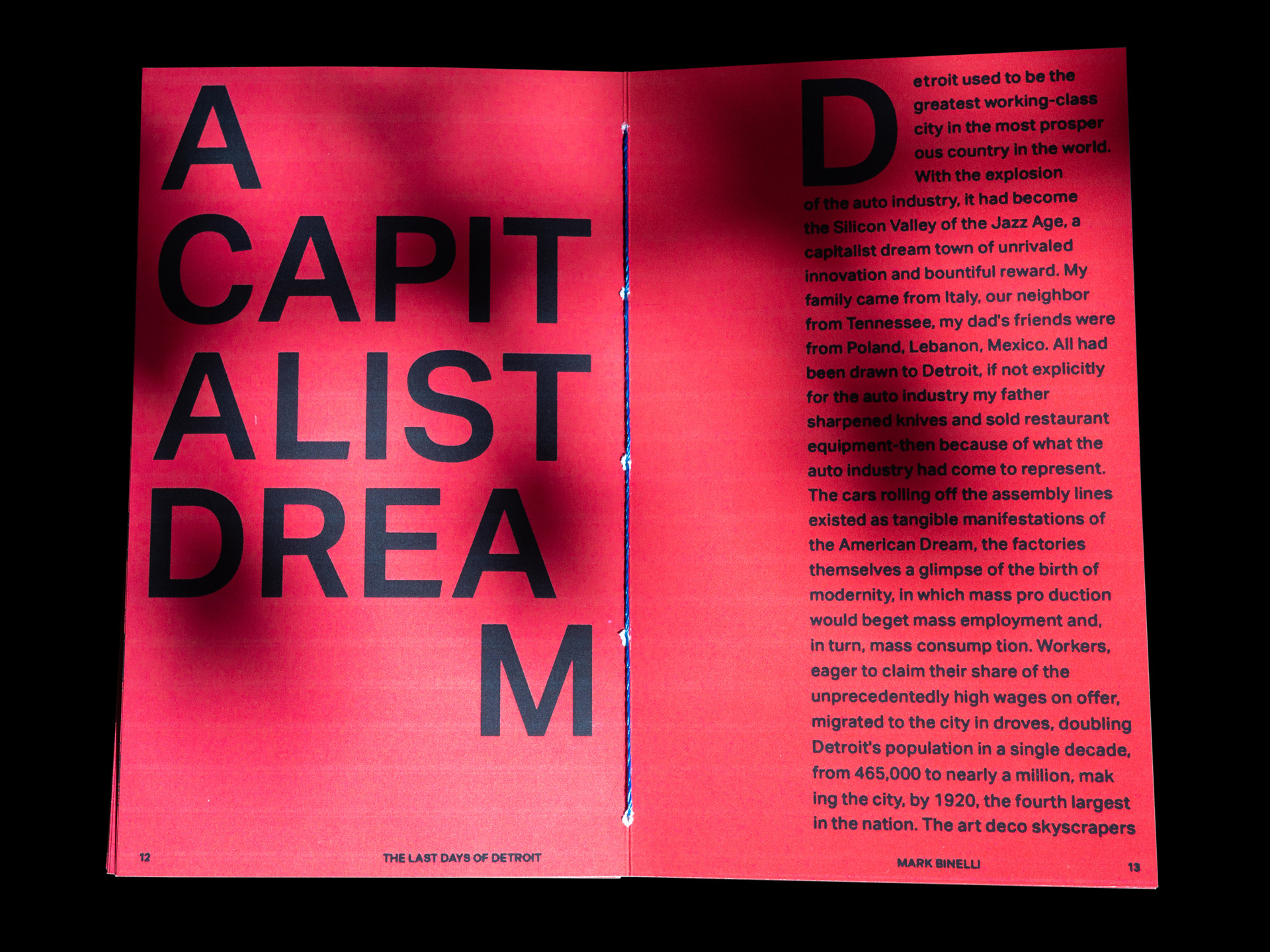

The Last Days of Detroit: Motorcars, Motown, and the Collapse
of an Industrial Giant
The "Last Days of Detroit: Motorcars, Motown, and the Collapse of an Industrial Giant" is a visual tour through Mark Binelli's intimate relationship with the city that chronicles Detroit's slow decay through the years. The communication evokes this degradation and subverts conventional notions of the American Dream under its bastardised aesthetic.
A folded American flag encases the book, serving as a poignant symbol of the demise of capitalist Detroit. Deepinging this narrative is the Swiss typeface that crumbles as the book unfolds, alluding to the collapse of modernist values embodied by Detroit.
Bush Kush
Packaging
2023
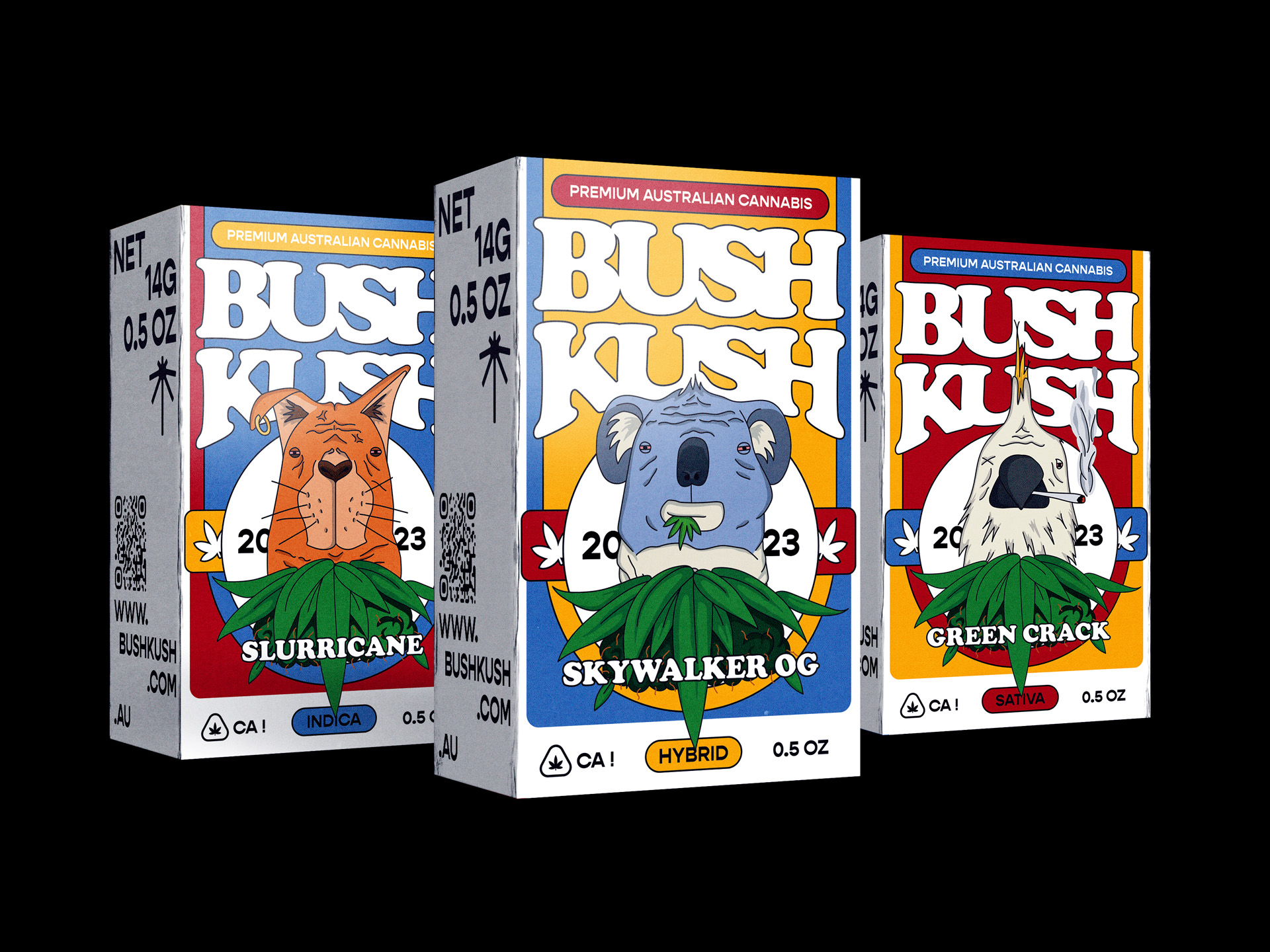

Bush Kush
The Art Direction for Bush Kush is a vibrant celebration of good times with a touch of irreverence. Embracing the brand's larrikin spirit, the design concept takes an illustrative approach that ensures the brand doesn't take itself too seriously.
Iconography and colour choice tie the packages to Australiana and characterise Bush Kush as a unique and approachable player in the Australian cannabis market.
Craft Victoria
Publication
2023
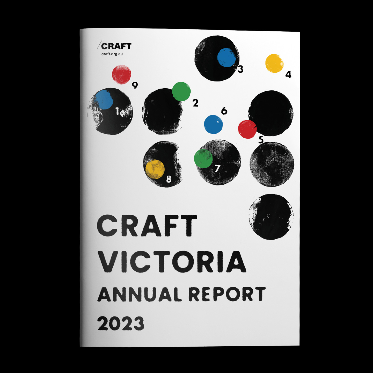

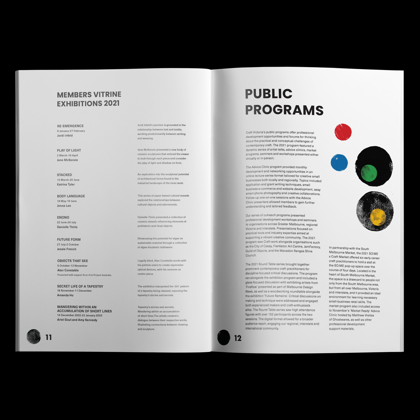
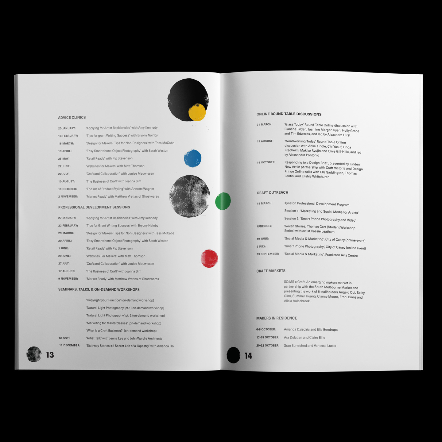
Craft Victoria 2023 Annual Report
The 2023 Annual Report for Craft Victoria explores the human impulse to create. The communication's sporadic colour use imparts the Annual Report with a playful bounciness while a uniform grid structure maintains the brands' professionalism. A dot-to-dot initiates user engagement and prefaces Craft Victoria's values of connection and collaboration.
The 2023 Annual Report for Craft Victoria explores the human impulse to create. The communication's sporadic colour use imparts the Annual Report with a playful bounciness while a uniform grid structure maintains the brands' professionalism. A dot-to-dot initiates user engagement and prefaces Craft Victoria's values of connection and collaboration.